Role
User Research
Product Strategy
UI Design
Interaction Design
Usability Testing
Tools
Figjam
Notion
Maze
Figma
Timeline
5 weeks
The Problem
The Wim Hof Method's designs do not accurately represent the content of the app, and featured designs that are not user friendly. It is difficult for users to navigate and tailor their experiences.
In addition, the business side of Wim Hof struggles to convert enough free users to paid pro plan users. There is a lack of incentives and designs that encourage habit forming usage.
The Solution
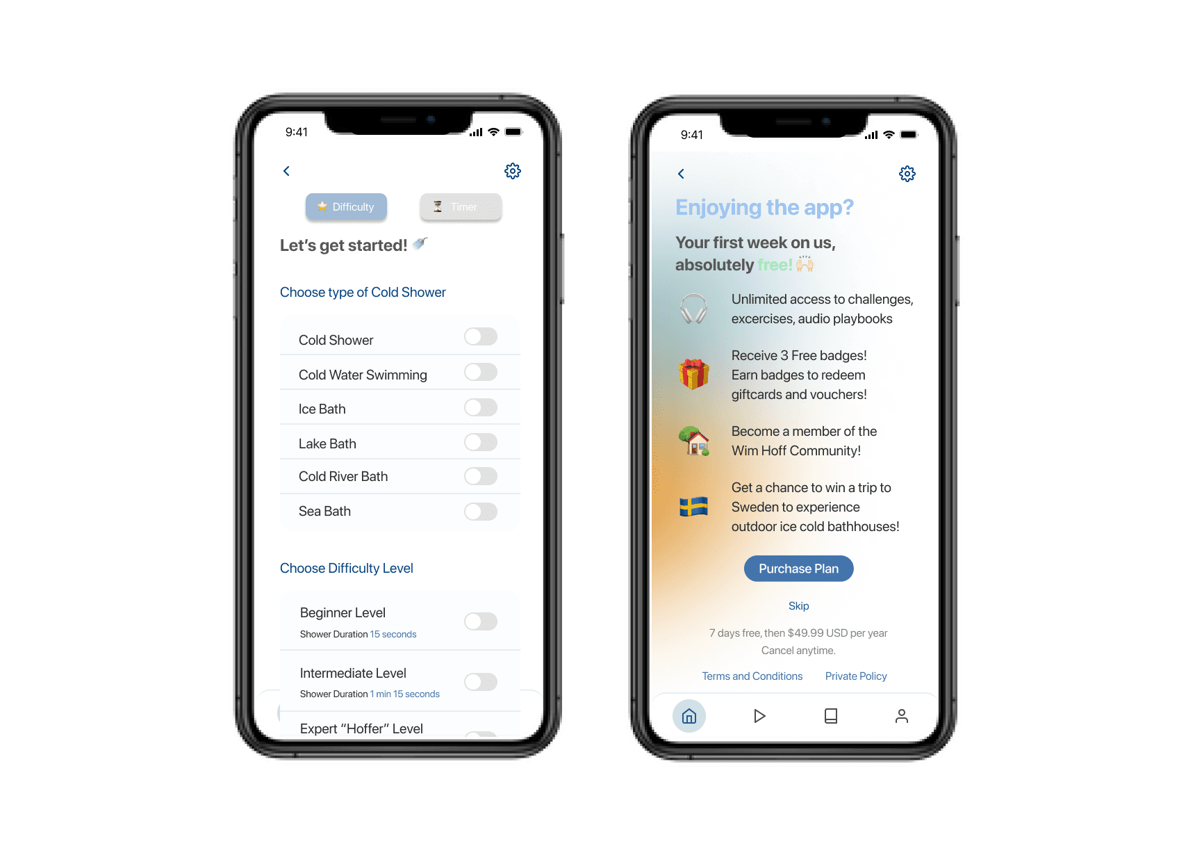
We made the first impression of the app clean and fun! We focused on redesigning the experience for new users. The welcoming animations catch the eye and encourage users to continue in the process. Using progressive disclosure and efficient organization, we are able to guide the users through their first look at the Wim Hof Method. With elements of gamification and personalization we were able to redesign an app that encourages repeat use and habit making.

Usability Review
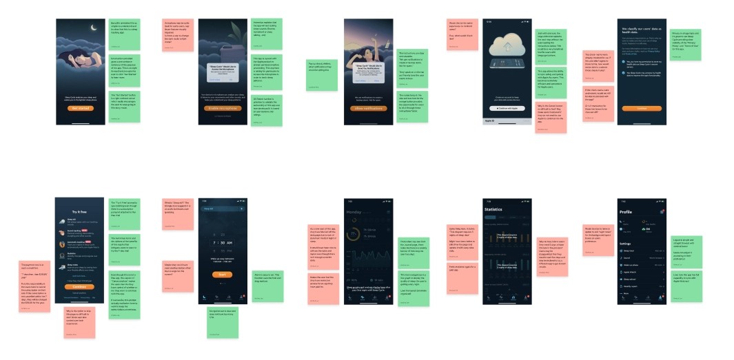
In order to direct our redesign, we started with a usability review in FigJam of the existing experience. Each red and green sticky note represents a pain point and wow moment respectively.

Business & User frustrations
Using our review, we identified two main frustrations to tackle in our redesign:
Primary Frustration
When new users take part in the 20-Day Cold Shower Challenge, they are unable to customize their showers and track their progress which results in a lack of incentive to continue using the app.
Secondary Frustration
When new users do not feel fulfilled by the Wim Hof Method challenges and app design they are less inclined to upgrade to the paid plan, causing the business model to fail.
Competitor Benchmarking
We then proceeded with competitor benchmarking to identify existing standards in competing products. Two direct competitors "Cold Shower Therapy" and "CST" and one indirect competitor "Sleep Cycle" were analyzed in FigJam using the same standards we used in our initial usability review.


Problem Space
New users are our primary users of concern, they face pain points in the inefficient and confusing cold water challenge screen. This may discourage them and cause users to discontinue using the product. The problem begins as soon as users load into the app for the first time, it is difficult to navigate the home screen due to a lack of clarity. Without improving the users' experiences, it will be impossible to maintain the business model.
So, how might we help new users who have not completed a cold shower start the 20 Day Cold Shower Challenge?
Ideation
With our problem defined, we began ideating possible solutions using a number of different ideation techniques including mind mapping, crazy 8's, and rapid prototyping. This ensured that we collected a large pool of possible solutions.
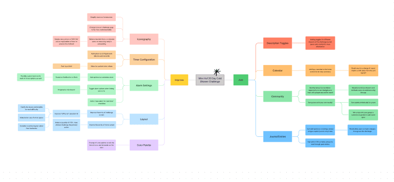
What can we add
Adding journal entries allow users to both personalize their experience and track their progress in a multitude of ways.
What can we improve
We improved the hierarchy of the different screens and reduced the quantity of call to action buttons. This streamlines the flow for the user.
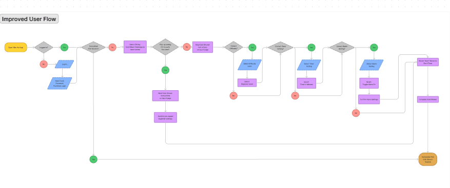
User Flows
Mapping the user flow allowed us to visualize the experience and change the flow to align with our new goals.

Rapid Prototyping
After mapping out our improved user flow, we set a time constraint and rapidly prototyped a solution. Working in low fidelity prototypes allowed us to use our time efficiently while iterating on our ideas.


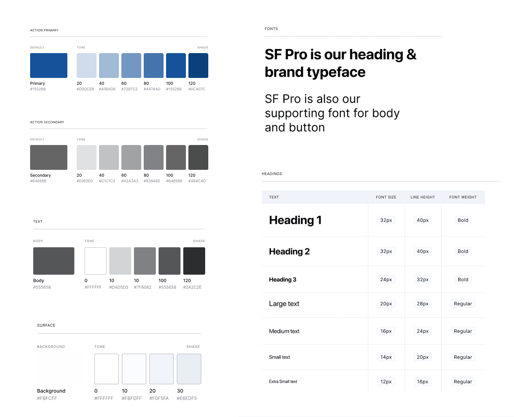
Styles
After creating possible solutions with ideation techniques, we defined the style guide and started creating components in Figma.
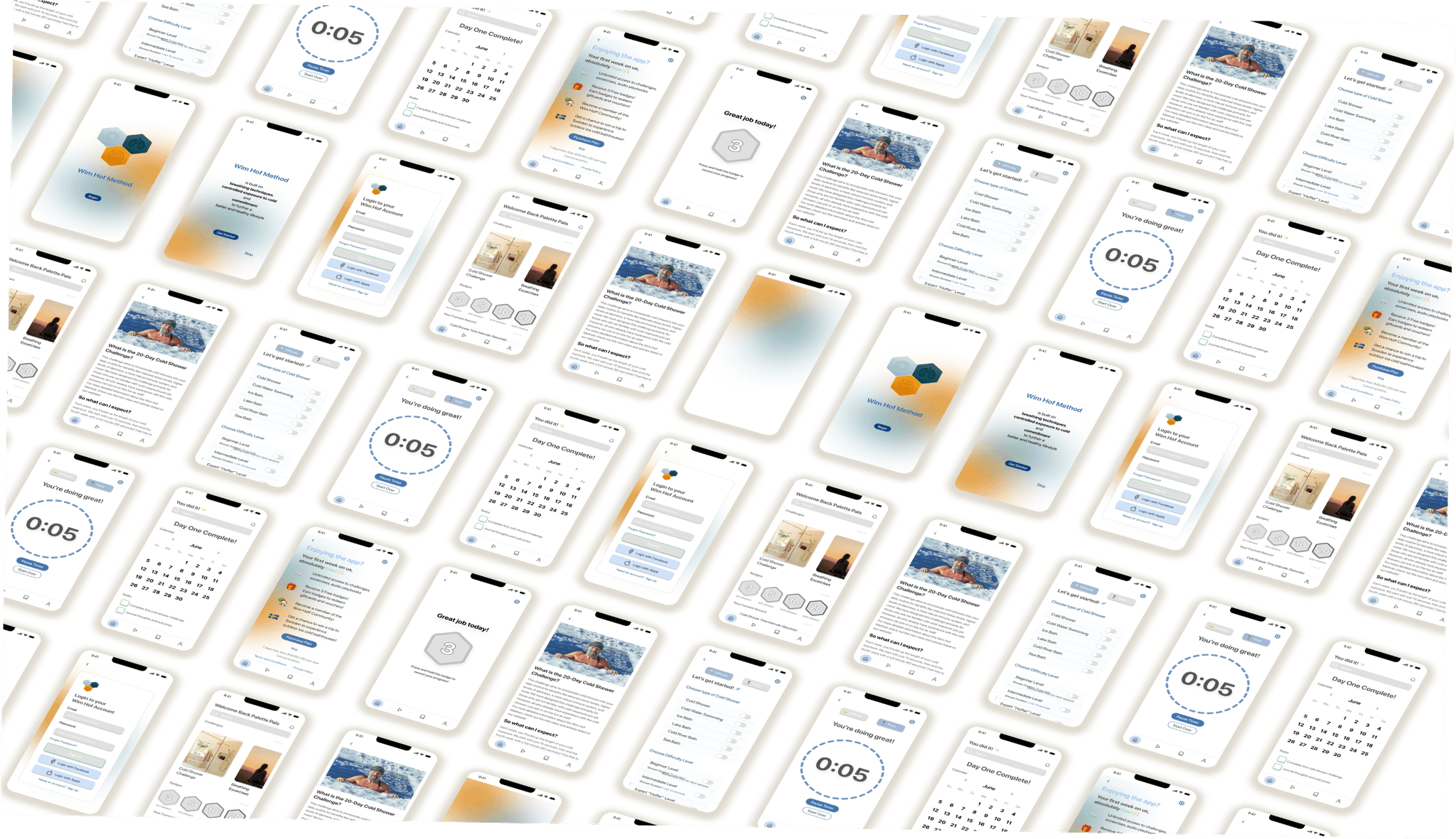
High Fidelity Prototype
One upgrade to high fidelity later, this is the final prototype our team created. It includes example interactions a user would take.
Usability Testing
With our high fidelity prototype completed, the next step was to iterate on our process. We wrote a script within Maze for the user to complete. By completing sample scenarios and tasks, we wanted to receive real feedback on the prototype.
A total of 16 users completed the test, which exceeded the target number of 10.

Test outcomes
Having tested the prototype, I learned where users encountered pain points and what screens created confusion. The data generated by Maze allowed us to accurately analyze and prioritize our improvements.
Three key learnings
1. Stick to the style guide, consistency is key!
- Some of our users submitted feedback that they were unsure where to click or how to proceed in the flow because of inconsistencies in style. In our second version, we ensured all buttons, text, and icons were consistent.
2. Challenge your initial thoughts.
- The usability test taught us a lot about the users wants and needs, some that were far outside our expectations.
3. Focus on smaller increments.
- We became ambitious while planning and wanted to redesign too many aspects of the app. This led to the quality of our overall design dropping. If we were to go back, we would focus on a smaller portion of the app and perfect it to the best of our abilities.
Next steps
If we had more time, we would have chosen to incorporate more improvements and streamline the process further before initiating another usability test, thus iterating on the process again.